Monday, October 22, 2012

Bathroom Design

Concept Poster

 
Rendered Perspective

About the Design

A home starts with dreaming of the space as a whole, and when that idea is brought to life, each piece grows together to create that whole. The bathroom continues in the path of universal design. The concept of accessibility was applied as a place any guest can use and a space that will be sustainable for a long time. 
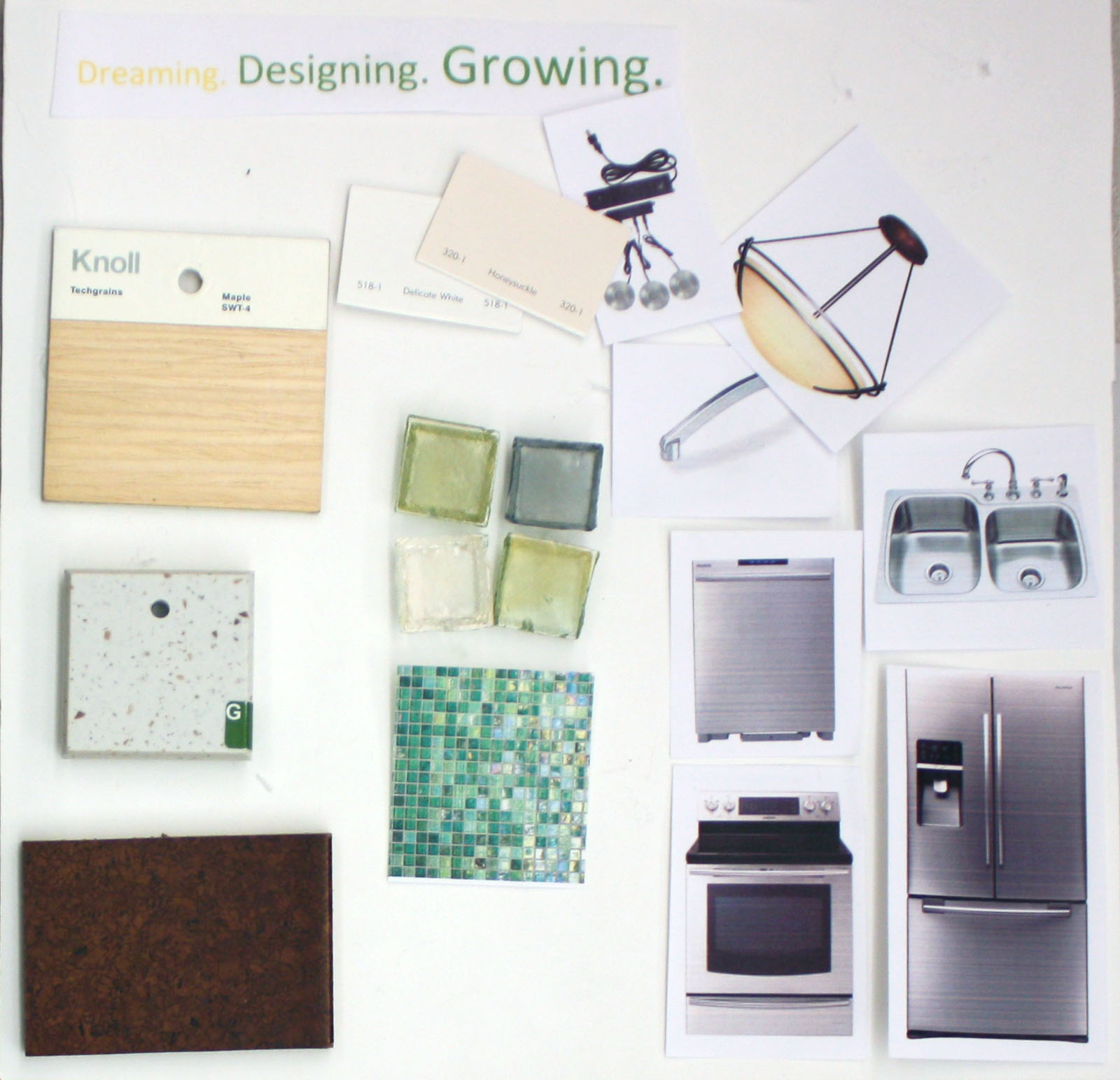
The finish materials used in the bathroom emulate building materials that are sustainable, yet decorative, and durable to withstand the uses of a bathroom. 

The sink area is connected to a built in storage cabinet. This design is effective in that it allows for a very universal use, as the heights of the cabinet space are both high and low. Keeping the sink and cabinet in the corner allows for a very open floor plan, with wheelchair accessibility.
 
Birds eye view of the North-West Corner.
The shower space is a unique feature as it has five sides; two are the wall, and three glass walls. To ensure privacy, the glass walls are frosted glass to the 5ft mark. The part of the shower with the two sides against the wall is covered by Indian red continental slate, porcelain tiles.  This material is a good choice in the shower because the material is durable through water exposure. Also accenting the shower is the same mosaic tiles as the back splash behind the sink, adding to the continuity in the space. The chrome shower head was placed at 6 ½ feet to accommodate different heights, and control lever at 3 feet.
I carefully designed the toilet area to continue the overall accessibility. An elongated toilet bowl and just 1.28 gallons of water per flush are highlights of this toilet. Also added on the walls are grab bars in requirements to the ADA codes.  A 36”x 48” clearance was included between the toilet, shower, and counter for frontal clearance to the toilet.
 In cohesion with the kitchen, the cabinets use the same handles. Also, the cabinets in the bathroom are similar to the ones in the kitchen in that they are both made out of maple. The ones in the bathroom are just a darker color than the kitchen ones. The continued use of wood cabinetry represents the materials used to build a home. Similar to the red tiles in the shower, how they resemble bricks, with a little bit of metal. 

Special Sketches

Sketch of the accent light and mirror over the sink.


Mermaid Rocks Border for black splash and shower accent.
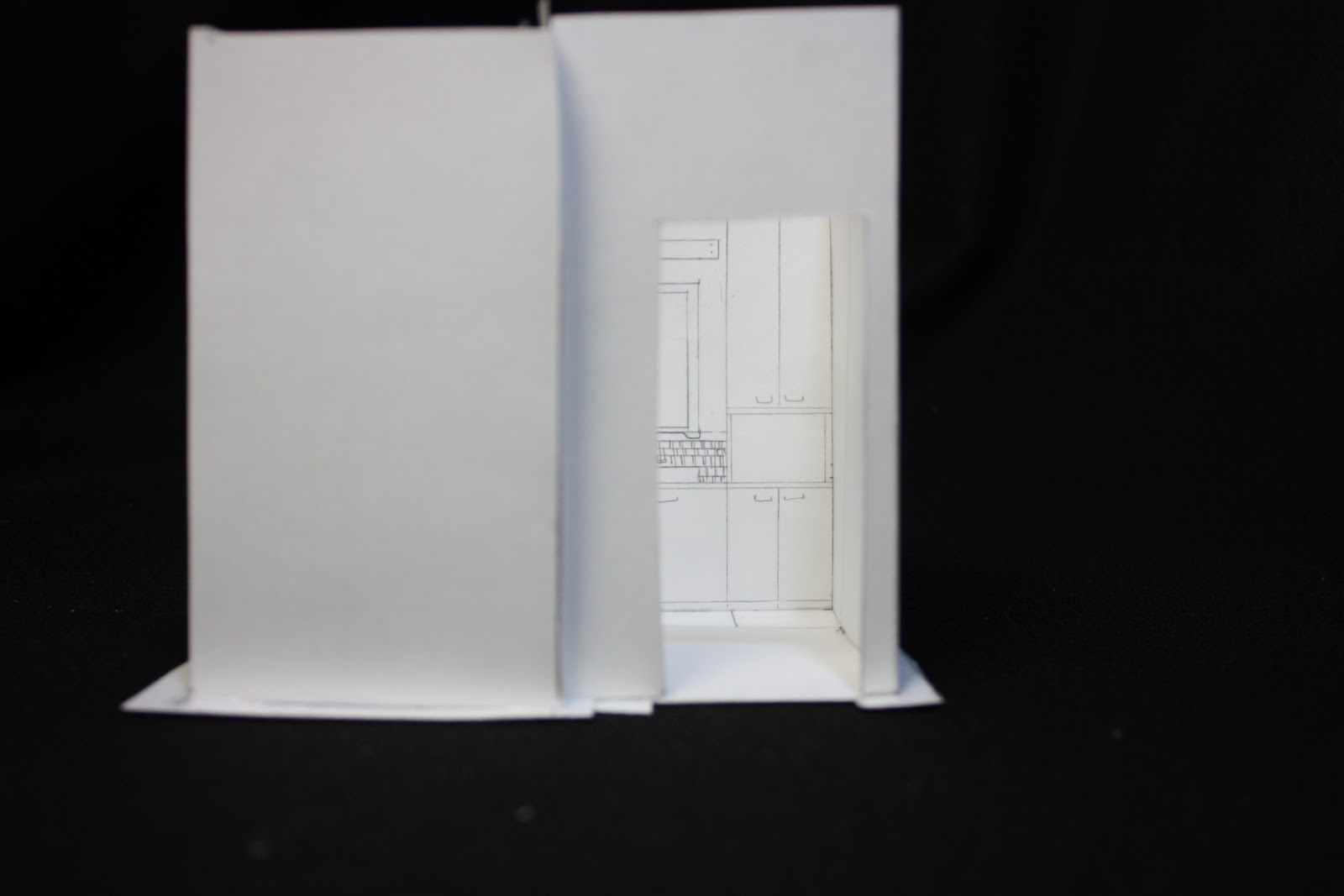


  Study Model 


Reflection

To further gain experience in residential design, this bathroom allowed me to work on a space that was very small detailed oriented in that it was a very small space, and the sink and toilet area had to meet ADA requirements. Overall, I feel my design is very successful. Utilizing the space in th best way, there is an exceptional amount of open space in the center of the room. Relating the building material to my concept of building a home and growth, the materials of wood, metal and stone "brick," were used. This time drafting my elevations, plan, plan oblique, and perspective took about half the amount of time as is did for the kitchen design as I was familiar with the space, and had just completed previous ones. 
Brushing up on my skills in Photoshop and InDesign, I added a background that starts as the porcelain tile used on the floor, fading into the wood used on the cabinets. This demonstrates my idea of growth, and building into something new. One thing I would change is the black font on the captions, the captions that were over the wood part of the background are difficult to read because I did not realize how dark the background was. Overall, I feel I was able to create a poster that successfully displays my bathroom design.
Though I wanted to focus on the essence of warmth, sustainability, and natural materials, a goal I will have for the one bedroom full apartment design is to include a point of focus, that being a light, piece of furniture, or add an accent color to liven up my design.

Monday, October 8, 2012

Dreaming. Designing. Growing.


This kitchen design for the St. Elmo two bedroom apartment demonstrates a culmination of many skills I have acquired throughout my education. Starting off with a previous project of developing a concept of what a  “Home” is and creating a model to demonstrate that statement, I further developed that idea into a kitchen.
The elements that were included in my final presentation board for my kitchen design consisted of two floor plans, one in ½” scale of the kitchen to living area, 1/8” scale of the whole 2nd floor of the apartment building, my concept statement, parti sketch, two ½” wall elevations, four one point perspective and one two point perspective drawings, one ¼” section, and a materials mock up board.
Throughout all these elements, I have learned that the process of designing a space is very detailed, takes a significant amount of planning, and most importantly time.
Throughout this project, I practiced my use of line weights, marker rendering and freehand drafting;hit-go-hit, professional dot, professional gap, and crossed corners.

Presentation board.
In the top left corner is a scaled floor plan of the apartment, showing the features in the kitchen and living area. A few key highlights included within my plan are two counter pantries, a dishwasher, double basin sink, Lazy Susan counter, stove, and french door refrigerator with a lower freezer. I placed these components in a U-Shaped kitchen in order to accommodate ADA codes in regards to  allowing a five foot turn radius from wheelchair accessibility. To keep the work space uninterrupted, the larger appliances and cabinets are located at the ends of the counter and the lower appliances in the middle with adequate counter space for daily tasks. The upper cabinets are 18 inches from the counter tops, and 12 inches from the wall, allowing plenty of work space underneath. Another feature included are the lights underneath the cabinets for added lighting in the work area.
Moving into the living area, due to the limited space in apartments, I added a storage closet, built in desk, and a built in booth with wheelchair accessibility. Keeping in mind specifications requested in the client interview, no microwave was added, and an open floor plan was keep in place. This plan works and relates to my concept statement because as the people living here grow older, they can adjust the space to their needs and easily navigated through the apartment.

This concept statement is demonstrating how my ideas of a home relates into my kitchen design. This ties in with a previous 3D concept model I developed from a poem and song inspiration.
Elevations of the East and North walls.
The view of the East wall on the left shows the relationship of the kitchen to the built in booth dining area. From this image the color scheme of complementary green and red are shown between the two areas. On this wall in the kitchen, there is a Lazy Susan cabinet on the far left, counter space, double basin sink, dishwasher, and built in pantry to the right. Viewing the North elevation, starting from the left, the 24 inch deep pantry/counter and 30 inch refrigerator are viewable from the West wall, and on the North wall, there is some counter space, the stove, pull out drawers, more counter space, and the 24 inches of the pantry on the right.
Perspective drawings
The top left and bottom three drawings are in one point perspectives showing the views as if you were walking into the space. The top left shows the relationship looking into the living area from the kitchen. In the two point perspective in the top right, off of the left of the kitchen is a built in study nook and storage closet. Also with these drawings I practiced my rendering skills by adding color.


This section view demonstrates a cut through of the interior, soffit, and exterior wall. There is a 6 inch interior wall, 8 inch soffit, and 9 inch exterior wall.
3D model of my kitchen design.
A 3 dimensional display of the kitchen, dining area, and a layout of the floor plan is shown. With the 10 foot ceiling height, the space appears larger than it is, and utilizing an open floor plan with a U- Shaped kitchen, this space is able to adapt to universal design in time.
Materials
With a goal in mind to use as much sustainable material as possible, I wanted the kitchen to feel light, clean, and green. For the cabinets, I chose maple from Knoll, with stainless steel handles. The counter tops are an off white material called ESurf, from the line ESeries from Formica. This product is made from 15% recycled content. Another sustainable product I used is cork for flooring. A business located in New Zealand called Cork Concepts. For the back splash, I chose the style of 1x1 inch tiles called Fiji Mosaic from DalTile. Undecided on all colors of paint, I want to use a light beige and white in the kitchen. All appliances are Samsung with a stainless steel finish.

Showrooms and House of the Immediate Future


Showroom at Design Tex
Throughout the study tour in Seattle, we toured several tour rooms, getting to experience all sorts of fields in design. Starting at the Seattle Design Center, I visited Mafi International Rugs and Design Tex textiles. I was very intrigued to learn about how the rugs were made by hand, and the customer could choose a preset design or design a rug of their own. It gives the client a chance to let their ideas shine, and this company was very passionate about meeting the client’s wants and needs. At Design Tex, the showroom manager introduced us to several types of fabric both residential and commercial.
Storage room at Pental
Showroom at Pental: Flooring Wall
Next, to accompany a current kitchen and bathroom design, I visited the DalTile and Pental showrooms. At both DalTile and Pental, I got to tour their showrooms and stock rooms where they keep all the slabs of stone for orders that will soon be cut and used in designs. At Pental, I was explained the different types of stone they carry, from granite, marble, limestone, and how each stone is give a letter grade to determine the cost, which depends on the desirability of the stone. At DalTile, we were also give a tour of the showroom and then we got to walk around and choose several samples of material that we would like and possibly use in our kitchen and bathroom designs.
                The next businesses on our itinerary included the showrooms at Knoll and 3Form. At Knoll, I was exposed to the evolution of the office environment. I learned that there are many elements that go into the design of an office work space. A designer has to consider cubicle height for privacy, and accessibility to communicate with coworkers, storage space location, work space, but most importantly, the universal design of the work chair. After gathering in the conference room for a short introduction about navigating the website, we were left to sketch in the show room.
Two chairs designed by Knoll.
Left: Platner Stool Right: Generation Task Chair


Knoll office space sketch


3Form office

Onto 3Form Lighting Company, I sincerely was blown away by the amazing products this company produces. This company takes inspiration from nature, ideas, and clients and to form light fixtures. After being welcomed by the manager and his team, we watched a few videos about the mission at 3Form and the elements that go into their design. We got to tour their work and construction room where they cut, form and assemble their products. I learned from the owner that sometimes in life, you have to take chances and go for your dreams and opportunities, as he was an architecture student who became an entrepreneur and started 3Form.


House of the Immediate Future
The last two destinations on the study tour was Habitat for Humanity: House of the Immediate Future and EHS Design. Natural air circulation, a wet box, and rain water use were some mentionable qualities that were featured in the House for the Immediate Future. After the tour, we got to sketch the exterior of the building. From the outside, it was easy to see a couple sustainable features of the home, including the multiple rows of windows, a ramp leading to the front entrance, and wood paneling on the outside.

                At EHS design, we toured their design firm which employs about half interior designers and half architectures.. Very high ceilings and large concrete columns were accompanied by echoes of voices traveling throughout the open office space. In their more private conference areas, a couple innovative elements in their office included full wall white boards, allowing writing on presentations, bleacher seats, and turning/folding boards with half pin board half white board. My favorite part of this design firm was resource room which included an extensive collection of materials, a light box with different colored light bulbs and individual work drawers.
From each location, I got to experience different elements of design. Each element serving a different purpose, but at the same time, everything related back together. With all this new knowledge in the interior design field, I hope to gain an internship in the near future to continue my learning outside of the classroom.
Group shot at the Seattle Design Center