Showing posts with label ID201FA12. Show all posts

Thursday, December 6, 2012

Dream. Design. Grow. One Bedroom Apartment and Common Area

Dream. Design. Grow.
Original Floor Plan
Vision
Building on my work from the previous kitchen and bathroom design of the two bedroom design, the one bedroom design in the St. Elmos hotel is the display of the process I went through to design a home.  Starting of with an inspiration song of what a home means to me, I chose the song "The House that Built Me" by Miranda Lambert. In this song, I understood a home to be a place that someone dreams about, and making those dreams come to life. A home starts out small, then slowly starts to grow, it may not always be perfect, but in the end, it is a place you call your own, and make memories.
Final Parti Sketch and Preliminaries

Building a Concept
From there, I brainstormed multiple parti sketches, in which I incorporated the ideas of  home, dreams, and building. Choosing a parti where I incorporated a swirl for a dream into a straight line, with small lines representing a a wooden fence, which is used in a "home". From there, a concept model was developed that resembled the parti sketch. I used brown materials and wood to emulate building materials, where in the apartment and common area, I used a significant amount of wood, metal, brick, and glass. I wanted the design to come out feeling warm and welcoming, while still meeting the guidelines of the client. Taking these concepts and ideas into mind, I can up with a concept statement.

Concept Statement
A home starts with thinking of multiple ideas, designing, rethinking, and redesigning. From there, an idea is taken, written down, and brought to life. As the building progresses, all the pieces grow together and function as a whole. A home leaves the impression of being warm and welcoming. As well as having a welcoming home, a home is a place where people grow and create memories. Evolving through time, a home needs to be incorporate sustainable elements for longtime use. This warm, sustainable feel is put together in neutral browns combined with a complementary color scheme of green and red tones. The materials continue to represent the building blocks of a home, shown in the metals, wood, and tile work. The completion of a home is a vision long in the making, full of components that will benefit a family both presently and into the future. This design is not only useable for day to day life; it has plenty of room for entertaining, growth, additions, and will be timeless design for whatever the future will hold.


In the spaces, I used the concept of warmth in a home to choose a color palette of neutral, yet warm browns, and use the accent complementary scheme of greens and browns. Since this is an apartment that can be used by a variety of users, this design will accommodate all.

Client Requests
Incorporating this statement and ideals to my design, I found the one bedroom apartment somewhat difficult to plan. Given a large space, I wanted to give the apartment an open feel, but yet warm an welcoming. Coming in from the entrance, I provided a space to walk in and built in storage to set your coats and shoes, next to a framed opening, which emulates a vision, looking into the rest of the space. The overall space needed to comply with ADA visit-ability standards, therefore, I designed all the door openings with 36" space, allowed for a five foot diameter turn around in the kitchen and bathroom, as well as the counter heights allow for side reach access, as well as the toilet being side accessible.Also to keep with accessibility, I redesigned the building's exterior in order to include at least one operable window in the bedroom. With this choice to redesign the windows, I created a more organized appearance on the outside, with 4' 6"x 5' windows, evenly spaced at either 6' or 12'. Not only does this provide organization to the home, but brings in extra natural light to the important gathering spaces of the home; the living area and kitchen.

To meet the sustainability requirement of this design, I chose a few sustainable materials to incorporate in my design. I originally chose a maple wood veneer to use on the cabinetry in the kitchen and the bathroom, later finding out that that wood was for commercial use, I had to find a different material. I then found a Soft Maple wood sample in which comes with the option to choose one of four stains to apply. For the bathroom, I choose to contrast the light porcelain floor with the darkest stain, and oppositely in the kitchen. Also in the kitchen, I found a dark cork floor that is made from cork tree. Lastly, while the rest of the apartment remains a wood floor, I found a carpet made out of recycled material for the bedroom.
In the common area, I wanted to bring restoration and reuse of materials from the original building into the space. With this goal, I designed a half brick, half glass wall on the left side of the entrance from the stairs, as well as two brick pillars . With the wall providing some privacy from traffic flow, around the other side is seating is available for the residents or the users of the spa to gather and enjoy each others company.


Reflection
Through this process work to a final presentation I grew as a designer in my work. I discovered and worked through many small details that came up along the way.  These details include looking up dimensions, knowing proximity requirements, drafting techniques, picking out materials and presenting my work in an way that is understandable to anyone who were to look at it. Time management was a large factor in this project, keeping myself of a schedule I find will be crucial in future projects in order to not rush my work and provide the best possible end product. If I had to change anything about my project, I would try to be more inventive and creative with my design. I do not feel I necessarily played it safe, but I would like to have included something that was a distinct focal point in the space and was easily recognizable from my concept sketch. Overall, I am very proud to show my completed project as I spent a lot of time thinking, asking questions, reevaluating, and coming up with my final product. 

Final Presentation Boards

Process Work: Parti Sketch (top left), Concept Model (top right), Concept Statement (middle right), Second Floor 1/8" Floor Plan (bottom left), Section (bottom right)

1/4" Floor Plan of One Bedroom and Common Area.  Elevations of One Bedroom.

Perspective Views of Common Area (top), 1BD entrance (top left), Living Area (bottom left), Kitchen (bottom right) and Common Area Materials

Exterior Elevations and Materials


Monday, November 26, 2012

Project Design Review at Gestalt


On Saturday November 17, 2012, I met with Debra Howard at Gestalt Design Studio to gain a professional perspective on my current one bedroom apartment design. She opened her business in Spokane and currently works of both residential and commercial designs. With a focus in historical preservation/adaptive reuse, sustainable design, this would be the perfect company to get feedback from.
Being a smaller business, Debra was familiar with working with building renovations, and materials used in the home. Going into the meeting, I was unsure about my materials that I selected for my design so I wanted to get her input on that. My main color palette is very neutral with complementary accents of green and red, so I was concerned that it would be too bland. Debra said that a neutral palette works well in residential design, especially apartments.
In the kitchen, I originally chose a brown, gray, and black flecked granite counter top, but with my glass green subway tile, Debra suggested that the granite choice may be too busy and instead brought me a couple black granite samples. I decided to go with a granite called "Absolute Black." This material will break up the light colors in the cabinetry, without being too busy.
Another suggestion in regards to my materials was in remove the copper border out of the shower and just use it as the sink's back splash in the bathroom. Debra informed me that over time, the water exposure to the copper would eventually ruin the coloring, and turn the copper a greenish color.  Instead, there is a small brown glass detail within the border, so she suggested that I used just that portion as a border or possibly a whole wall.
After my visit, I was very glad I able to get an opinion from a professional design who does this everyday. It was nice getting an outside perspective and practicing explaining my concept to someone who was new to the project. Also, I was able to communicate and explain my concept and ideas through my drawings. 

Monday, October 8, 2012

Dreaming. Designing. Growing.


This kitchen design for the St. Elmo two bedroom apartment demonstrates a culmination of many skills I have acquired throughout my education. Starting off with a previous project of developing a concept of what a  “Home” is and creating a model to demonstrate that statement, I further developed that idea into a kitchen.
The elements that were included in my final presentation board for my kitchen design consisted of two floor plans, one in ½” scale of the kitchen to living area, 1/8” scale of the whole 2nd floor of the apartment building, my concept statement, parti sketch, two ½” wall elevations, four one point perspective and one two point perspective drawings, one ¼” section, and a materials mock up board.
Throughout all these elements, I have learned that the process of designing a space is very detailed, takes a significant amount of planning, and most importantly time.
Throughout this project, I practiced my use of line weights, marker rendering and freehand drafting;hit-go-hit, professional dot, professional gap, and crossed corners.

Presentation board.
In the top left corner is a scaled floor plan of the apartment, showing the features in the kitchen and living area. A few key highlights included within my plan are two counter pantries, a dishwasher, double basin sink, Lazy Susan counter, stove, and french door refrigerator with a lower freezer. I placed these components in a U-Shaped kitchen in order to accommodate ADA codes in regards to  allowing a five foot turn radius from wheelchair accessibility. To keep the work space uninterrupted, the larger appliances and cabinets are located at the ends of the counter and the lower appliances in the middle with adequate counter space for daily tasks. The upper cabinets are 18 inches from the counter tops, and 12 inches from the wall, allowing plenty of work space underneath. Another feature included are the lights underneath the cabinets for added lighting in the work area.
Moving into the living area, due to the limited space in apartments, I added a storage closet, built in desk, and a built in booth with wheelchair accessibility. Keeping in mind specifications requested in the client interview, no microwave was added, and an open floor plan was keep in place. This plan works and relates to my concept statement because as the people living here grow older, they can adjust the space to their needs and easily navigated through the apartment.

This concept statement is demonstrating how my ideas of a home relates into my kitchen design. This ties in with a previous 3D concept model I developed from a poem and song inspiration.
Elevations of the East and North walls.
The view of the East wall on the left shows the relationship of the kitchen to the built in booth dining area. From this image the color scheme of complementary green and red are shown between the two areas. On this wall in the kitchen, there is a Lazy Susan cabinet on the far left, counter space, double basin sink, dishwasher, and built in pantry to the right. Viewing the North elevation, starting from the left, the 24 inch deep pantry/counter and 30 inch refrigerator are viewable from the West wall, and on the North wall, there is some counter space, the stove, pull out drawers, more counter space, and the 24 inches of the pantry on the right.
Perspective drawings
The top left and bottom three drawings are in one point perspectives showing the views as if you were walking into the space. The top left shows the relationship looking into the living area from the kitchen. In the two point perspective in the top right, off of the left of the kitchen is a built in study nook and storage closet. Also with these drawings I practiced my rendering skills by adding color.


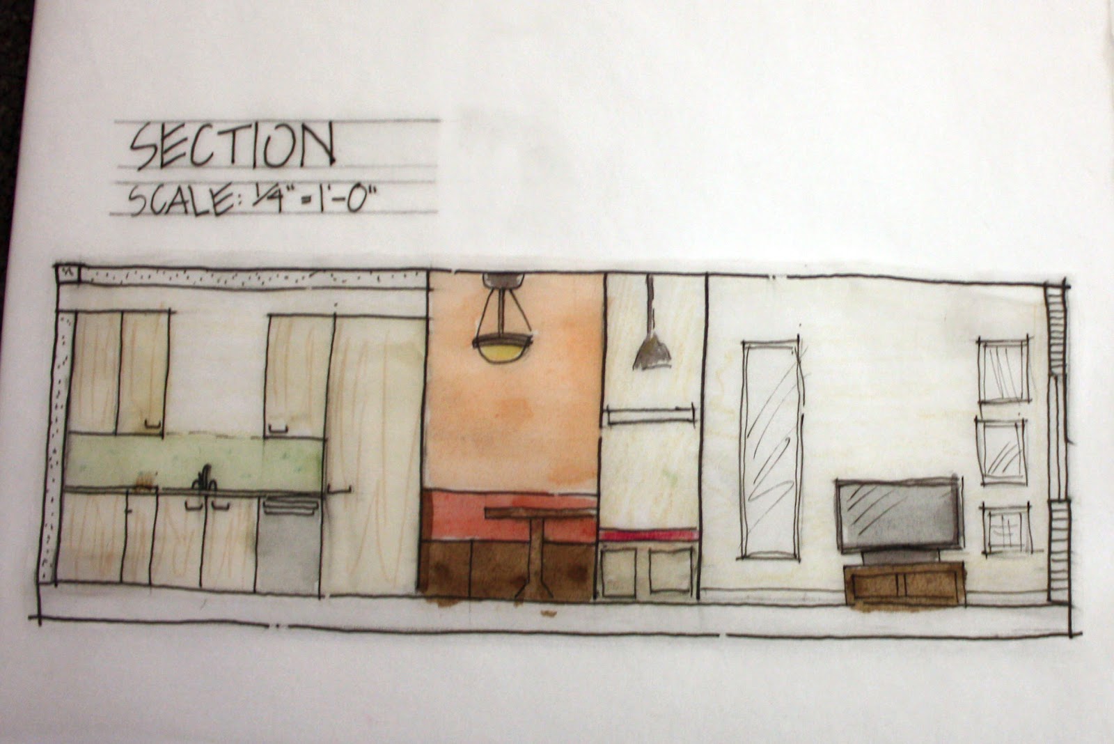
This section view demonstrates a cut through of the interior, soffit, and exterior wall. There is a 6 inch interior wall, 8 inch soffit, and 9 inch exterior wall.
3D model of my kitchen design.
A 3 dimensional display of the kitchen, dining area, and a layout of the floor plan is shown. With the 10 foot ceiling height, the space appears larger than it is, and utilizing an open floor plan with a U- Shaped kitchen, this space is able to adapt to universal design in time.
Materials
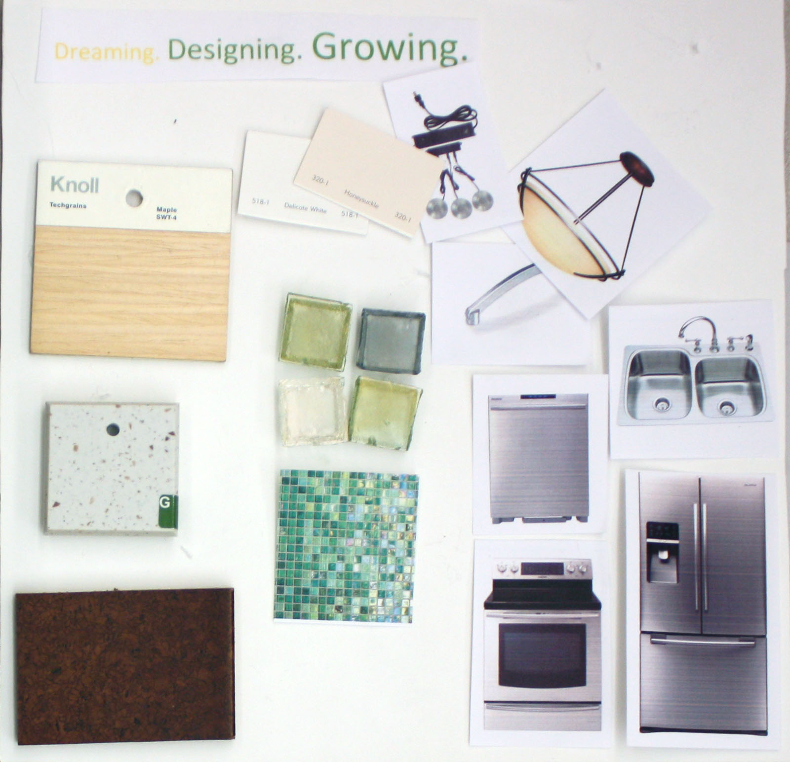
With a goal in mind to use as much sustainable material as possible, I wanted the kitchen to feel light, clean, and green. For the cabinets, I chose maple from Knoll, with stainless steel handles. The counter tops are an off white material called ESurf, from the line ESeries from Formica. This product is made from 15% recycled content. Another sustainable product I used is cork for flooring. A business located in New Zealand called Cork Concepts. For the back splash, I chose the style of 1x1 inch tiles called Fiji Mosaic from DalTile. Undecided on all colors of paint, I want to use a light beige and white in the kitchen. All appliances are Samsung with a stainless steel finish.

Monday, September 24, 2012

Ride, Don't Walk

 This blog post demonstrates an important issue regarding designing any building; wheelchair accessibility. Through a real life simulation of myself doing daily tasks in a wheelchair, I now have a new perspective of the importance of designing spaces to accommodate people in wheelchairs.
Here are some pictures, observations, and sketches of some of the tasks I completed.
Reaching for a magazine on the 3rd shelf.
Frontal view sitting in the wheelchair.

The only closed stall in the restroom was very difficult to enter. The stall was so close to the wall I had to maneuver my way in. Once I was in the stall, there was no way I was able to close the door, let alone turn around.

Washing my hands in a public bathroom. The sink height allowed me to roll under the sink ad gain access.

About to roll up the ramp, arms are very fatigued at this point.

Using the automatic door opener. All the buttons I had access to were easily reachable at arms length.

Sketch of me pressing the automatic door opener button.

A strenuous stretch to try and pick up my coffee order at the stand.
Brief sketch of myself ordering from the coffee stand, sketch shows comparison of the counter height to me in the wheelchair.

Looking straight on at the coffee stand. The top was a good foot and a half above my head.

After I completed this demonstration, I realize how easy it is to take granted the daily tasks in life, and for people in wheelchairs, these daily tasks are a challenge. As a designer, I believe everyone should have equal opportunity and access to all spaces. Universal design has evolved into a necessity in any design as the population in our society is very diverse. Designers need to evaluate the challenges that people with disabilities face everyday, and from there create a design that best accommodates those needs. Every single person in our society are equal, and the designed environment should be accessible by all, regardless of cost. With the technologies the world has come up with should make buildings easily usable by all.


Monday, September 10, 2012

Home Concept Development

Inspiration Song/Poem

Our House

Our house is a house we built together
We have laid every brick one by one
We have nailed every board one blow at a time
Our house is a house we built together

Every board is not perfect some are not straight
Some walls are built in the wrong place
We must carefully remove those boards
We must carefully remove those walls

We must rebuild them in the correct place
We must replace each board one by one
Until the holes are all closed
Until all the walls are in the right place
When we finish we can stand back and say
This is our house, a house we built together
Jamey Einrem


This house that built me

I know they say you can't go home again I just had to come back one last time Ma'am, I know you don't know me from Adam But these hand prints on the front steps are mine
Up those stairs in that little back bedroom Is where I did my homework and I learned to play guitar And I bet you didn't know under that live oak My favorite dog is buried in the yard
I thought if I could touch this place or feel it This brokenness inside me might start healing Out here it's like I'm someone else I thought that maybe I could find myself
If I could just come in, I swear I'll leave Won't take nothing but a memory From the house that built me
Mama cut out pictures of houses for years From "Better Homes and Garden" magazine Plans were drawn and concrete poured And nail by nail and board by board Daddy gave life to mama's dream
I thought if I could touch this place or feel it This brokenness inside me might start healing Out here it's like I'm someone else I thought that maybe I could find myself
If I could just come in, I swear I'll leave Won't take nothing but a memory From the house that built me
You leave home, you move on And you do the best you can I got lost in this whole world And forgot who I am
I thought if I could touch this place or feel it This brokenness inside me might start healing Out here it's like I'm someone else I thought that maybe I could find myself
If I could walk around, I swear I'll leave Won't take nothing but a memory From the house that built me
Miranda Lambert

Home: Concept Web


 2D Concept/Parti sketches


 Study Model

Front View

 Final Concept Model

Side View


Right Side View

Left Side View


 Reflection

When thinking of a home, there are many interpretations of that meaning. To help me describe what a home means to me, I looked to the poem Our House by Jamey Einrem and the song The House that Built Me by Miranda Lambert. My concept is that a home is a place the you dream about and make come to life, shown by all the spirals and swirling paper. A home grows as the time goes on, as represented by the fence. As the model grows, the “fence” grows taller, stronger and fits together. A home may not be perfect, but it is a place you call your own.
I continued to grow on creating 2D concept sketches that grasp my concept. My drawings first started off being a little to literal as I drew bricks, houses, and objects. My goal was to display my idea of a home more abstractly. I was able to achieve this by piecing together a couple drawings together.
The materials I ended up using worked well for my design concept as I want to portray a fence that started small and individual pieces being distant from each other, to eventually tall and placed together. The stand represents a strong foundation a home is built on. And the color brown to me represents building materials.
At first glance, someone may not be able to see exactly how this model represents a home. Through my concept development and explanations, I believe I achieved my goal of creating a cohesive model of my idea of “Home.”