Dream. Design. Grow.
 |
| Original Floor Plan |
Building on my work from the previous kitchen and bathroom design of the two bedroom design, the one bedroom design in the St. Elmos hotel is the display of the process I went through to design a home. Starting of with an inspiration song of what a home means to me, I chose the song "The House that Built Me" by Miranda Lambert. In this song, I understood a home to be a place that someone dreams about, and making those dreams come to life. A home starts out small, then slowly starts to grow, it may not always be perfect, but in the end, it is a place you call your own, and make memories.
 |
| Final Parti Sketch and Preliminaries |
Building a Concept
From there, I brainstormed multiple parti sketches, in which I incorporated the ideas of home, dreams, and building. Choosing a parti where I incorporated a swirl for a dream into a straight line, with small lines representing a a wooden fence, which is used in a "home". From there, a concept model was developed that resembled the parti sketch. I used brown materials and wood to emulate building materials, where in the apartment and common area, I used a significant amount of wood, metal, brick, and glass. I wanted the design to come out feeling warm and welcoming, while still meeting the guidelines of the client. Taking these concepts and ideas into mind, I can up with a concept statement.
Concept Statement
A home starts with thinking of
multiple ideas, designing, rethinking, and redesigning. From there, an idea is
taken, written down, and brought to life. As the building progresses, all the
pieces grow together and function as a whole. A home leaves the impression
of being warm and welcoming. As well as having a welcoming home, a home is a
place where people grow and create memories. Evolving through time, a home needs
to be incorporate sustainable elements for longtime use. This warm, sustainable
feel is put together in neutral browns combined with a complementary color
scheme of green and red tones. The materials continue to represent the building
blocks of a home, shown in the metals, wood, and tile work. The completion of a home is a vision
long in the making, full of components that will benefit a family both
presently and into the future. This design is not only useable for day to
day life; it has plenty of room for entertaining, growth, additions, and will
be timeless design for whatever the future will hold.
 In the spaces, I used the concept of warmth in a home to choose a
color palette of neutral, yet warm browns, and use the accent
complementary scheme of greens and browns. Since this is an apartment
that can be used by a variety of users, this design will accommodate
all.
In the spaces, I used the concept of warmth in a home to choose a
color palette of neutral, yet warm browns, and use the accent
complementary scheme of greens and browns. Since this is an apartment
that can be used by a variety of users, this design will accommodate
all.Client Requests

 Incorporating this statement and ideals to my design, I found the one bedroom apartment somewhat difficult to plan. Given a large space, I wanted to give the apartment an open feel, but yet warm an welcoming. Coming in from the entrance, I provided a space to walk in and built in storage to set your coats and shoes, next to a framed opening, which emulates a vision, looking into the rest of the space. The overall space needed to comply with ADA visit-ability standards, therefore, I designed all the door openings with 36" space, allowed for a five foot diameter turn around in the kitchen and bathroom, as well as the counter heights allow for side reach access, as well as the toilet being side accessible.Also to keep with accessibility, I redesigned the building's exterior in order to include at least one operable window in the bedroom. With this choice to redesign the windows, I created a more organized appearance on the outside, with 4' 6"x 5' windows, evenly spaced at either 6' or 12'. Not only does this provide organization to the home, but brings in extra natural light to the important gathering spaces of the home; the living area and kitchen.
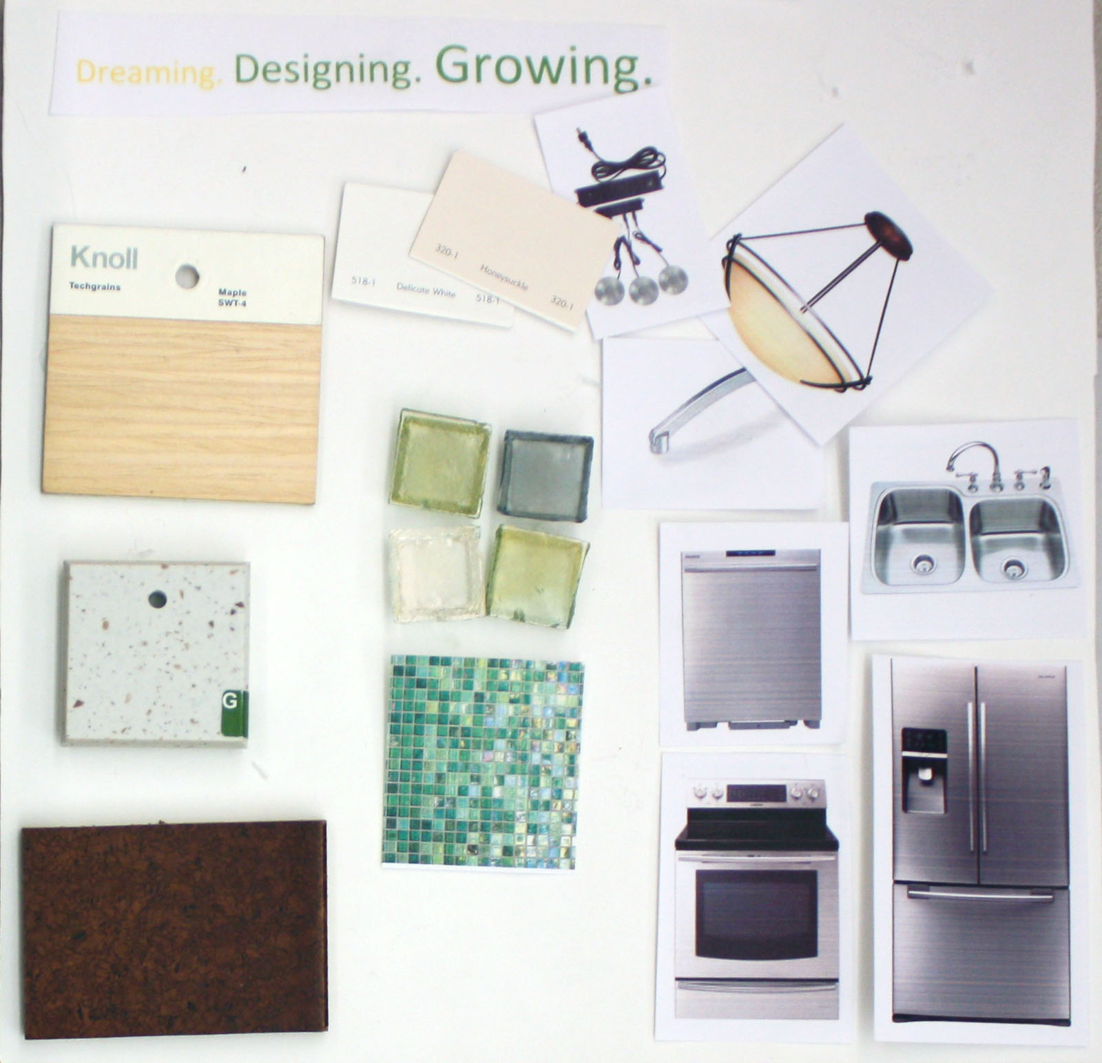
  To meet the sustainability requirement of this design, I chose a few sustainable materials to incorporate in my design. I originally chose a maple wood veneer to use on the cabinetry in the kitchen and the bathroom, later finding out that that wood was for commercial use, I had to find a different material. I then found a Soft Maple wood sample in which comes with the option to choose one of four stains to apply. For the bathroom, I choose to contrast the light porcelain floor with the darkest stain, and oppositely in the kitchen. Also in the kitchen, I found a dark cork floor that is made from cork tree. Lastly, while the rest of the apartment remains a wood floor, I found a carpet made out of recycled material for the bedroom.
  In the common area, I wanted to bring restoration and reuse of materials from the original building into the space. With this goal, I designed a half brick, half glass wall on the left side of the entrance from the stairs, as well as two brick pillars . With the wall providing some privacy from traffic flow, around the other side is seating is available for the residents or the users of the spa to gather and enjoy each others company.
Reflection
Through this process work to a final presentation I grew as a designer in my work. I discovered and worked through many small details that came up along the way. These details include looking up dimensions, knowing proximity requirements, drafting techniques, picking out materials and presenting my work in an way that is understandable to anyone who were to look at it. Time management was a large factor in this project, keeping myself of a schedule I find will be crucial in future projects in order to not rush my work and provide the best possible end product. If I had to change anything about my project, I would try to be more inventive and creative with my design. I do not feel I necessarily played it safe, but I would like to have included something that was a distinct focal point in the space and was easily recognizable from my concept sketch. Overall, I am very proud to show my completed project as I spent a lot of time thinking, asking questions, reevaluating, and coming up with my final product.
Final Presentation Boards
 |
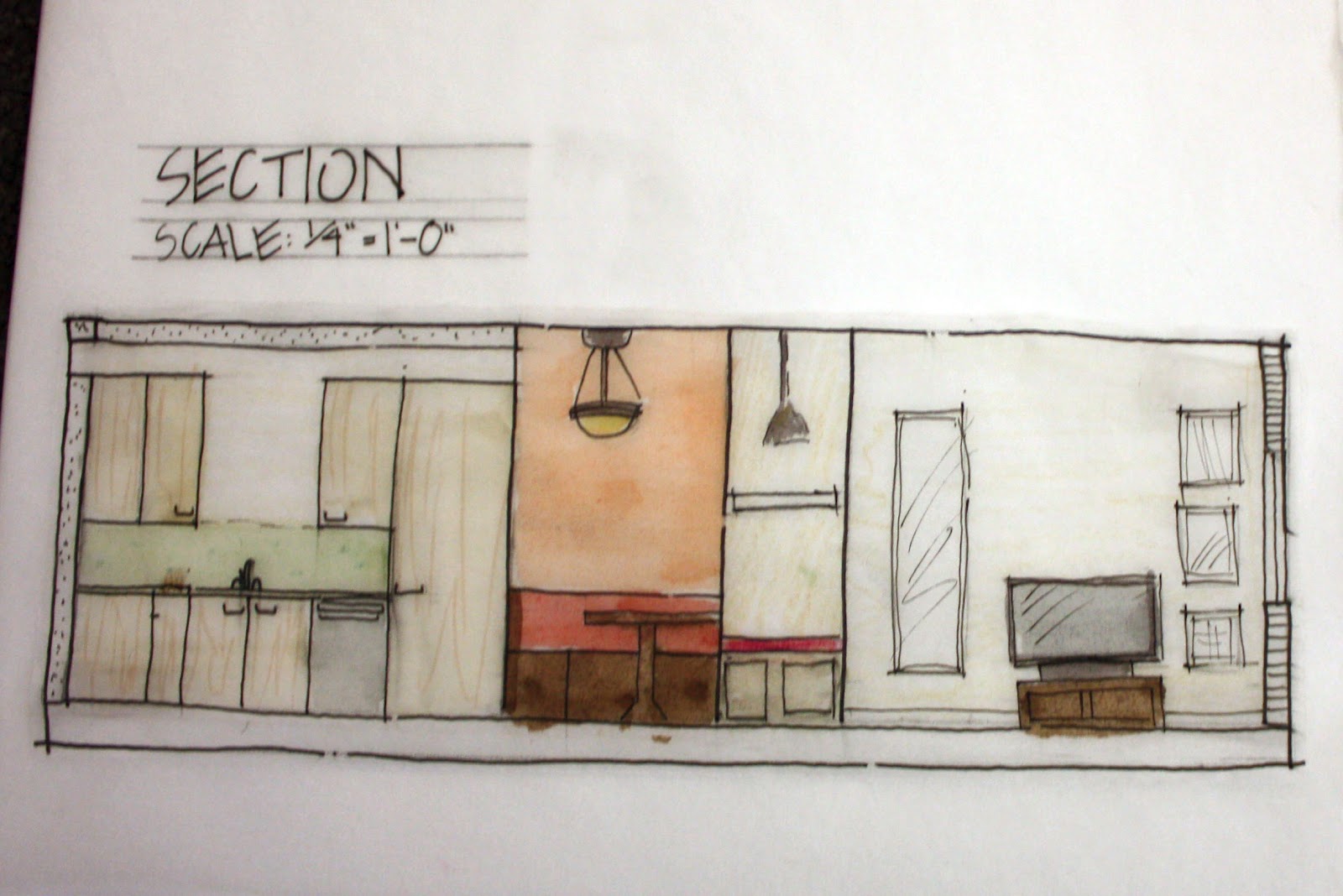
| Process Work: Parti Sketch (top left), Concept Model (top right), Concept Statement (middle right), Second Floor 1/8" Floor Plan (bottom left), Section (bottom right) |
 |
| 1/4" Floor Plan of One Bedroom and Common Area. Elevations of One Bedroom. |
 |
| Perspective Views of Common Area (top), 1BD entrance (top left), Living Area (bottom left), Kitchen (bottom right) and Common Area Materials |
 |
| Exterior Elevations and Materials |