Showing posts with label Sketches. Show all posts

Monday, April 29, 2013

Pufferbelly Depot Renovation

Redesigning Pufferbelly Train Depot in Pullman, WA into a Gallery, Studio space, and residence for a glass blower, was a long process of concept development, trial and error, and working with codes and regulations. This specific project was a new experience in having to consider applying elements for ADA codes in the public space, as well as considering Universal Design elements for the residence as the artist's spouse had a visual impairment. In addition, this was a historic preservation project, requiring the ticket wall and stairs wall to remain in the new building.


Site Plan of Pufferbelly Depot

Exterior Elevation of Depot

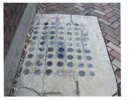
With the guidelines in place, I tarted off with concept development, I explored the history and inspiration from a picture of this concrete slab with purple and blue glass circles embedded in the concrete outside of the building. I was drawn to the colors, shape, and history behind them as they had changed color over time, and were used for a skylight to the basement. I explored lines and cracks within the concrete, representing paths people take in life, whether they be easy are hard (thick and thin lines), to the element of light and changing over time. The most powerful images and ideas that came from this exploration was circles, change, and repetition.
Inspiration Picture

After completing several pages of idea generation, I compiled multiple parti sketches, demonstrating my three inspiration words: Shape, Color, and Repetition. These words would derive and form the rest of my design process. With four of my favorite parti sketches chosen, I took two of them and developed modules to be placed several patterns that would soon be taken and made into a textile that would be incorporated into my design. I used this textile as a wallpaper in the Gallery bathroom, paired with white subway tiles that are currently used in the building.

Gallery Bathroom: Textile inspired Wallpaper

With my concept development in progress, I developed a bench design that will be placed the entrance of the gallery space. Developing the bench was a challenge because glass and concrete were the two important materials that I wanted to incorporate in the design, so figuring out how to combine them in a unique way was difficult. My original design proposed a challenge in how the bench would be able to balance properly, therefore I had to redevelop a bench with some sort of leg. I came up with 9 cylinder legs on each side reflecting the number of glass tiles and in a repetition form.

The biggest part of this project I found challenge was spatial issues due to the glass blower needing a very large studio space, taking away from the residence and gallery. I knew for the gallery space, I wanted an open space that could be versatile to the different displays and pieces he makes. In relation to having a retail space within the gallery for sales, I kept the original ticket window in this space and this also connects the gallery space to his office, storage and studio space for a nice transition to all the public space. In the residence space, I wanted there to be an open living area and a more private bedroom area. To achieve this, the entrance opens to a little hallway with a storage closet to the left and a circular bench to the right. Stepping farther into the space, an open plan combines the laundry/ 1/2 bath, dining area, kitchen and living space while giving the bedroom and master bathroom it's own private area to the side. I found using the study model was very useful in developing spatial awareness of room and how the design would truly work outside of 2D paper space.

3D Study Model


Overall throughout the design, I incorporated my concept and ADA/UD elements into the design. All doorways are 36" wide, all passing hallways and barriers are no less than 36" wide, and high contrast of colors are included to accommodate people with vision impairments. Natural light was combined with additional levels of lighting throughout the space. Tying into both UD design and the use of colors blue, purple, and grey textiles and paints from my concept can be seen throughout the design, as well as circular furnishings. Darker floors and lighter walls allow for clear determination of the floor versus the walls. Also, a sustainable factor was taken into  desperation, keeping a few existing walls in addition to the two required wall, sustainable materials, and shared water walls. The drawings that were completed in the project reiterate and demonstrate the applications of these concepts as seen in the Egress Plan, Demolition Plan, and Furniture Floor Plan.

Furniture Floor Plan

Demolition Plan showing walls and doors to remain, be added, and torn down.

Egress Plan: Farthest travel distance to a safe exit and ADA space requirements.


This project took my work as a progressive Interior Designer to a new level. New technical aspects that I was expected to incorporate were applied, following real building codes, and overall working in a time frame that pushed me to be both creative and accurate. Creatively, I believe I improved on developing a concept and carrying that throughout my design and not losing sight of my direction. I In addition to working on my creativity, I was able to practice on my rendering skills and perspective drawings (seen below). Another aspect that I gained sight on is all the different paths I can take with an Interior Design major, whether that be commercial design, residential design, furniture design, textile design, and even being a person that develops concepts and does research on projects. I really enjoyed this project and think it was a great learning experience.

Gallery Perspective with ticket wall to the left.
Studio space with fire resistant concrete floors and existing brick walls.

Entrance of residence, looking into kitchen and living area.

Master bedroom, with view of master bath and walk in closet.


Monday, October 8, 2012

Dreaming. Designing. Growing.


This kitchen design for the St. Elmo two bedroom apartment demonstrates a culmination of many skills I have acquired throughout my education. Starting off with a previous project of developing a concept of what a  “Home” is and creating a model to demonstrate that statement, I further developed that idea into a kitchen.
The elements that were included in my final presentation board for my kitchen design consisted of two floor plans, one in ½” scale of the kitchen to living area, 1/8” scale of the whole 2nd floor of the apartment building, my concept statement, parti sketch, two ½” wall elevations, four one point perspective and one two point perspective drawings, one ¼” section, and a materials mock up board.
Throughout all these elements, I have learned that the process of designing a space is very detailed, takes a significant amount of planning, and most importantly time.
Throughout this project, I practiced my use of line weights, marker rendering and freehand drafting;hit-go-hit, professional dot, professional gap, and crossed corners.

Presentation board.
In the top left corner is a scaled floor plan of the apartment, showing the features in the kitchen and living area. A few key highlights included within my plan are two counter pantries, a dishwasher, double basin sink, Lazy Susan counter, stove, and french door refrigerator with a lower freezer. I placed these components in a U-Shaped kitchen in order to accommodate ADA codes in regards to  allowing a five foot turn radius from wheelchair accessibility. To keep the work space uninterrupted, the larger appliances and cabinets are located at the ends of the counter and the lower appliances in the middle with adequate counter space for daily tasks. The upper cabinets are 18 inches from the counter tops, and 12 inches from the wall, allowing plenty of work space underneath. Another feature included are the lights underneath the cabinets for added lighting in the work area.
Moving into the living area, due to the limited space in apartments, I added a storage closet, built in desk, and a built in booth with wheelchair accessibility. Keeping in mind specifications requested in the client interview, no microwave was added, and an open floor plan was keep in place. This plan works and relates to my concept statement because as the people living here grow older, they can adjust the space to their needs and easily navigated through the apartment.

This concept statement is demonstrating how my ideas of a home relates into my kitchen design. This ties in with a previous 3D concept model I developed from a poem and song inspiration.
Elevations of the East and North walls.
The view of the East wall on the left shows the relationship of the kitchen to the built in booth dining area. From this image the color scheme of complementary green and red are shown between the two areas. On this wall in the kitchen, there is a Lazy Susan cabinet on the far left, counter space, double basin sink, dishwasher, and built in pantry to the right. Viewing the North elevation, starting from the left, the 24 inch deep pantry/counter and 30 inch refrigerator are viewable from the West wall, and on the North wall, there is some counter space, the stove, pull out drawers, more counter space, and the 24 inches of the pantry on the right.
Perspective drawings
The top left and bottom three drawings are in one point perspectives showing the views as if you were walking into the space. The top left shows the relationship looking into the living area from the kitchen. In the two point perspective in the top right, off of the left of the kitchen is a built in study nook and storage closet. Also with these drawings I practiced my rendering skills by adding color.


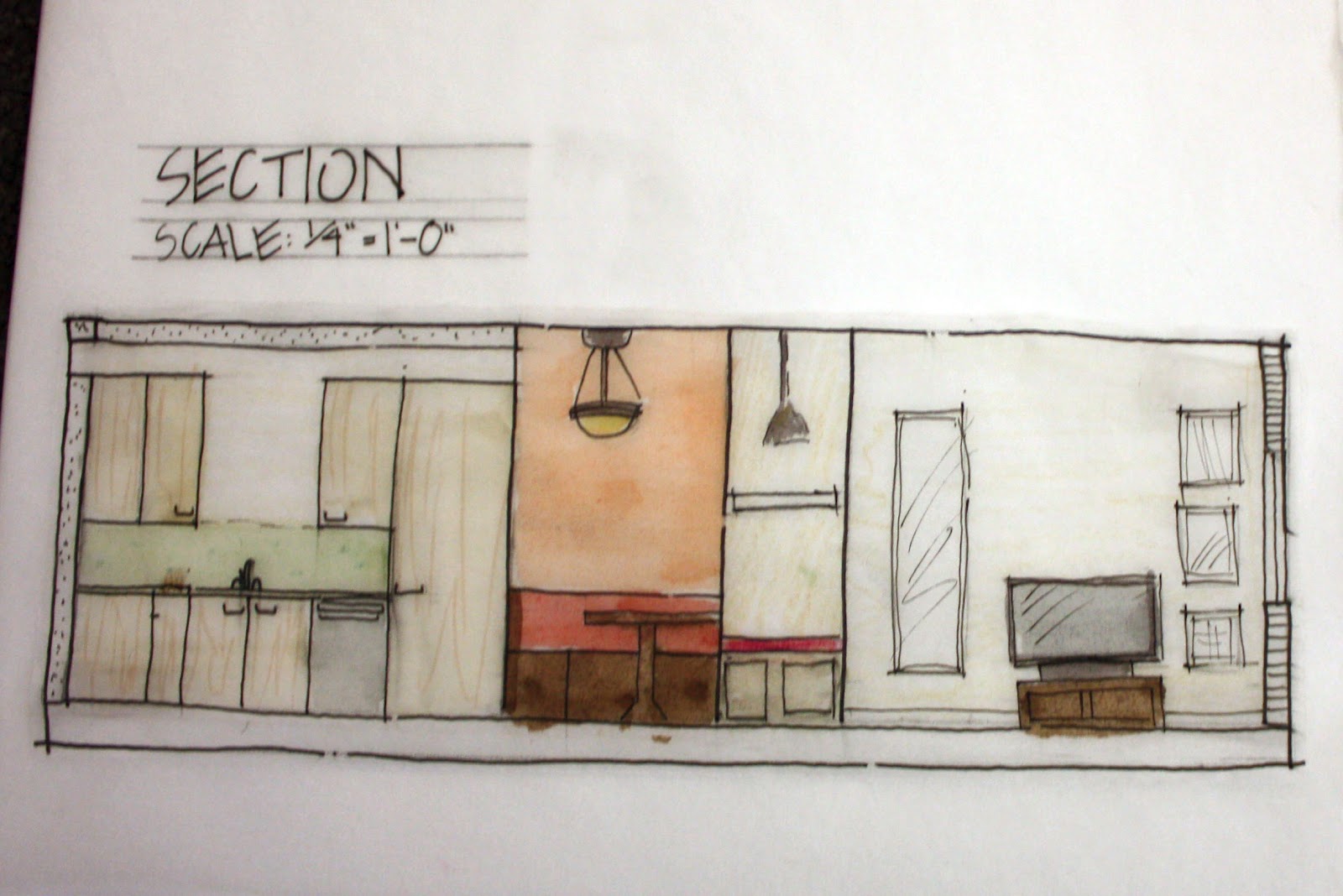
This section view demonstrates a cut through of the interior, soffit, and exterior wall. There is a 6 inch interior wall, 8 inch soffit, and 9 inch exterior wall.
3D model of my kitchen design.
A 3 dimensional display of the kitchen, dining area, and a layout of the floor plan is shown. With the 10 foot ceiling height, the space appears larger than it is, and utilizing an open floor plan with a U- Shaped kitchen, this space is able to adapt to universal design in time.
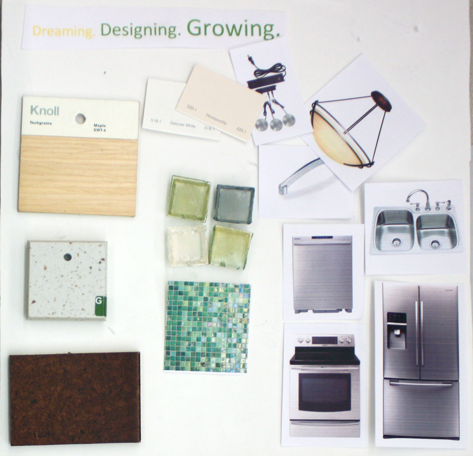
Materials
With a goal in mind to use as much sustainable material as possible, I wanted the kitchen to feel light, clean, and green. For the cabinets, I chose maple from Knoll, with stainless steel handles. The counter tops are an off white material called ESurf, from the line ESeries from Formica. This product is made from 15% recycled content. Another sustainable product I used is cork for flooring. A business located in New Zealand called Cork Concepts. For the back splash, I chose the style of 1x1 inch tiles called Fiji Mosaic from DalTile. Undecided on all colors of paint, I want to use a light beige and white in the kitchen. All appliances are Samsung with a stainless steel finish.

Showrooms and House of the Immediate Future


Showroom at Design Tex
Throughout the study tour in Seattle, we toured several tour rooms, getting to experience all sorts of fields in design. Starting at the Seattle Design Center, I visited Mafi International Rugs and Design Tex textiles. I was very intrigued to learn about how the rugs were made by hand, and the customer could choose a preset design or design a rug of their own. It gives the client a chance to let their ideas shine, and this company was very passionate about meeting the client’s wants and needs. At Design Tex, the showroom manager introduced us to several types of fabric both residential and commercial.
Storage room at Pental
Showroom at Pental: Flooring Wall
Next, to accompany a current kitchen and bathroom design, I visited the DalTile and Pental showrooms. At both DalTile and Pental, I got to tour their showrooms and stock rooms where they keep all the slabs of stone for orders that will soon be cut and used in designs. At Pental, I was explained the different types of stone they carry, from granite, marble, limestone, and how each stone is give a letter grade to determine the cost, which depends on the desirability of the stone. At DalTile, we were also give a tour of the showroom and then we got to walk around and choose several samples of material that we would like and possibly use in our kitchen and bathroom designs.
                The next businesses on our itinerary included the showrooms at Knoll and 3Form. At Knoll, I was exposed to the evolution of the office environment. I learned that there are many elements that go into the design of an office work space. A designer has to consider cubicle height for privacy, and accessibility to communicate with coworkers, storage space location, work space, but most importantly, the universal design of the work chair. After gathering in the conference room for a short introduction about navigating the website, we were left to sketch in the show room.
Two chairs designed by Knoll.
Left: Platner Stool Right: Generation Task Chair


Knoll office space sketch


3Form office

Onto 3Form Lighting Company, I sincerely was blown away by the amazing products this company produces. This company takes inspiration from nature, ideas, and clients and to form light fixtures. After being welcomed by the manager and his team, we watched a few videos about the mission at 3Form and the elements that go into their design. We got to tour their work and construction room where they cut, form and assemble their products. I learned from the owner that sometimes in life, you have to take chances and go for your dreams and opportunities, as he was an architecture student who became an entrepreneur and started 3Form.


House of the Immediate Future
The last two destinations on the study tour was Habitat for Humanity: House of the Immediate Future and EHS Design. Natural air circulation, a wet box, and rain water use were some mentionable qualities that were featured in the House for the Immediate Future. After the tour, we got to sketch the exterior of the building. From the outside, it was easy to see a couple sustainable features of the home, including the multiple rows of windows, a ramp leading to the front entrance, and wood paneling on the outside.

                At EHS design, we toured their design firm which employs about half interior designers and half architectures.. Very high ceilings and large concrete columns were accompanied by echoes of voices traveling throughout the open office space. In their more private conference areas, a couple innovative elements in their office included full wall white boards, allowing writing on presentations, bleacher seats, and turning/folding boards with half pin board half white board. My favorite part of this design firm was resource room which included an extensive collection of materials, a light box with different colored light bulbs and individual work drawers.
From each location, I got to experience different elements of design. Each element serving a different purpose, but at the same time, everything related back together. With all this new knowledge in the interior design field, I hope to gain an internship in the near future to continue my learning outside of the classroom.
Group shot at the Seattle Design Center

Urban Sketchers: Olympic Sculpture Park


Group shot at Olympic Park

Sketching at Olympic Sculpture Park gave me multiple opportunities to sketch many different views and sculptures. A highlight of the day was to accompanied by the Urban Sketchers group in Seattle. After sketching for a while, I walked around to talk to some of the sketchers and ask them about their work. One woman I talked to had just started her sketch of a sculpture. The drawing consisted of a simple outline of the sculpture and a little bit of the landscape, but from there she started to add some color with water color. I thought that would be a great way for me to try to add color to my sketches as the rendering markers tend to bleed. She directed me to a local Seattle art store with great supplies, and recommended Dan Smith Inc watercolors, even just the basic blue, red and yellow would work.
                Another woman I approached had a very detailed drawing of a sculpture at the end of a tree covered path. Like the previous sketcher, she had did not have too much drawing detail, but added detail and depth with the colors she used. She said she spends about 10 minutes doing the line work and then 20 to 30 minutes adding in color. She was using a Pentallic watercolor paper sketch book and watercolor. Flipping through her book, I was amazed at how much detail and how lifelike she was able to make her drawing with the use of watercolor.
Throughout the sketch crawl, I completed four sketches. I would say they were more incomplete as I wish I had more time to add detail and possibly try to use watercolor on them, I think this calls for a future trip to Seattle. During the day, I worked on my cross hatching skills to add  value and shading to objects, measuring buildings with my pencil, and rendering markers for color. My favorite part about getting to work with the Urban Sketchers was to see their love and passion in art. They enjoy sketching so much they get together to have sketch crawls and share their work with the community. Also, finding inspiration in everyday life is a beautiful thing, and they inspire me to become better at my craft.
Using rendering markers to add color

Space Needle and local buildings, use of colored pencils

Love and Loss Sculpture, working on cross hatching

On the board walk looking towards Pike Street Market