Redesigning Pufferbelly Train Depot in Pullman, WA into a Gallery, Studio space, and residence for a glass blower, was a long process of concept development, trial and error, and working with codes and regulations. This specific project was a new experience in having to consider applying elements for ADA codes in the public space, as well as considering Universal Design elements for the residence as the artist's spouse had a visual impairment. In addition, this was a historic preservation project, requiring the ticket wall and stairs wall to remain in the new building.
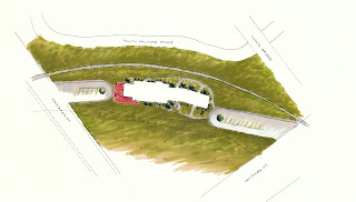 |
| Site Plan of Pufferbelly Depot |
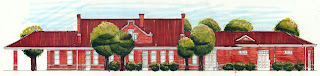 |
| Exterior Elevation of Depot |
With the guidelines in place, I tarted off with concept development, I explored the history and inspiration from a picture of this concrete slab with purple and blue glass circles embedded in the concrete outside of the building. I was drawn to the colors, shape, and history behind them as they had changed color over time, and were used for a skylight to the basement. I explored lines and cracks within the concrete, representing paths people take in life, whether they be easy are hard (thick and thin lines), to the element of light and changing over time. The most powerful images and ideas that came from this exploration was circles, change, and repetition.
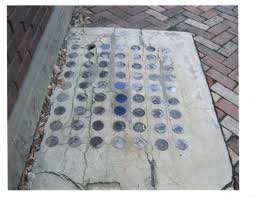 |
| Inspiration Picture |
After completing several pages of idea generation, I compiled multiple parti sketches, demonstrating my three inspiration words: Shape, Color, and Repetition. These words would derive and form the rest of my design process. With four of my favorite parti sketches chosen, I took two of them and developed modules to be placed several patterns that would soon be taken and made into a textile that would be incorporated into my design. I used this textile as a wallpaper in the Gallery bathroom, paired with white subway tiles that are currently used in the building.
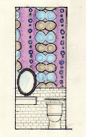 |
| Gallery Bathroom: Textile inspired Wallpaper |
With my concept development in progress, I developed a bench design that will be placed the entrance of the gallery space. Developing the bench was a challenge because glass and concrete were the two important materials that I wanted to incorporate in the design, so figuring out how to combine them in a unique way was difficult. My original design proposed a challenge in how the bench would be able to balance properly, therefore I had to redevelop a bench with some sort of leg. I came up with 9 cylinder legs on each side reflecting the number of glass tiles and in a repetition form.
The biggest part of this project I found challenge was spatial issues due to the glass blower needing a very large studio space, taking away from the residence and gallery. I knew for the gallery space, I wanted an open space that could be versatile to the different displays and pieces he makes. In relation to having a retail space within the gallery for sales, I kept the original ticket window in this space and this also connects the gallery space to his office, storage and studio space for a nice transition to all the public space. In the residence space, I wanted there to be an open living area and a more private bedroom area. To achieve this, the entrance opens to a little hallway with a storage closet to the left and a circular bench to the right. Stepping farther into the space, an open plan combines the laundry/ 1/2 bath, dining area, kitchen and living space while giving the bedroom and master bathroom it's own private area to the side. I found using the study model was very useful in developing spatial awareness of room and how the design would truly work outside of 2D paper space.
 |
| 3D Study Model |
Overall throughout the design, I incorporated my concept and ADA/UD elements into the design. All doorways are 36" wide, all passing hallways and barriers are no less than 36" wide, and high contrast of colors are included to accommodate people with vision impairments. Natural light was combined with additional levels of lighting throughout the space. Tying into both UD design and the use of colors blue, purple, and grey textiles and paints from my concept can be seen throughout the design, as well as circular furnishings. Darker floors and lighter walls allow for clear determination of the floor versus the walls. Also, a sustainable factor was taken into desperation, keeping a few existing walls in addition to the two required wall, sustainable materials, and shared water walls. The drawings that were completed in the project reiterate and demonstrate the applications of these concepts as seen in the Egress Plan, Demolition Plan, and Furniture Floor Plan.
 |
| Furniture Floor Plan |
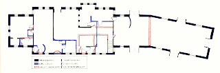 |
| Demolition Plan showing walls and doors to remain, be added, and torn down. |
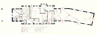 |
| Egress Plan: Farthest travel distance to a safe exit and ADA space requirements. |
This project took my work as a progressive Interior Designer to a new level. New technical aspects that I was expected to incorporate were applied, following real building codes, and overall working in a time frame that pushed me to be both creative and accurate. Creatively, I believe I improved on developing a concept and carrying that throughout my design and not losing sight of my direction. I In addition to working on my creativity, I was able to practice on my rendering skills and perspective drawings (seen below). Another aspect that I gained sight on is all the different paths I can take with an Interior Design major, whether that be commercial design, residential design, furniture design, textile design, and even being a person that develops concepts and does research on projects. I really enjoyed this project and think it was a great learning experience.
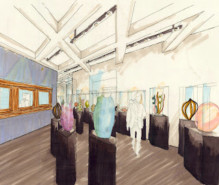 |
| Gallery Perspective with ticket wall to the left. |
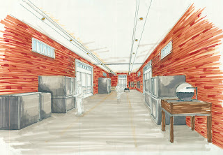 |
| Studio space with fire resistant concrete floors and existing brick walls. |
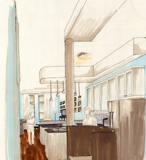 |
| Entrance of residence, looking into kitchen and living area. |
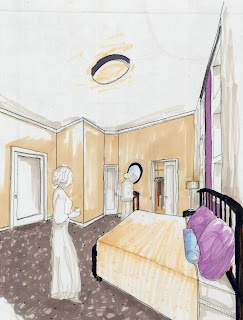 |
| Master bedroom, with view of master bath and walk in closet. |


No comments:
Post a Comment