Monday, April 29, 2013

Pufferbelly Depot Renovation

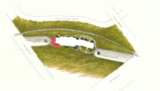
Redesigning Pufferbelly Train Depot in Pullman, WA into a Gallery, Studio space, and residence for a glass blower, was a long process of concept development, trial and error, and working with codes and regulations. This specific project was a new experience in having to consider applying elements for ADA codes in the public space, as well as considering Universal Design elements for the residence as the artist's spouse had a visual impairment. In addition, this was a historic preservation project, requiring the ticket wall and stairs wall to remain in the new building.


Site Plan of Pufferbelly Depot

Exterior Elevation of Depot

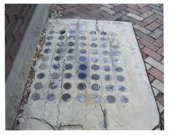
With the guidelines in place, I tarted off with concept development, I explored the history and inspiration from a picture of this concrete slab with purple and blue glass circles embedded in the concrete outside of the building. I was drawn to the colors, shape, and history behind them as they had changed color over time, and were used for a skylight to the basement. I explored lines and cracks within the concrete, representing paths people take in life, whether they be easy are hard (thick and thin lines), to the element of light and changing over time. The most powerful images and ideas that came from this exploration was circles, change, and repetition.
Inspiration Picture

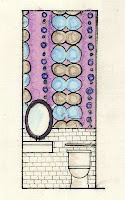
After completing several pages of idea generation, I compiled multiple parti sketches, demonstrating my three inspiration words: Shape, Color, and Repetition. These words would derive and form the rest of my design process. With four of my favorite parti sketches chosen, I took two of them and developed modules to be placed several patterns that would soon be taken and made into a textile that would be incorporated into my design. I used this textile as a wallpaper in the Gallery bathroom, paired with white subway tiles that are currently used in the building.

Gallery Bathroom: Textile inspired Wallpaper

With my concept development in progress, I developed a bench design that will be placed the entrance of the gallery space. Developing the bench was a challenge because glass and concrete were the two important materials that I wanted to incorporate in the design, so figuring out how to combine them in a unique way was difficult. My original design proposed a challenge in how the bench would be able to balance properly, therefore I had to redevelop a bench with some sort of leg. I came up with 9 cylinder legs on each side reflecting the number of glass tiles and in a repetition form.

The biggest part of this project I found challenge was spatial issues due to the glass blower needing a very large studio space, taking away from the residence and gallery. I knew for the gallery space, I wanted an open space that could be versatile to the different displays and pieces he makes. In relation to having a retail space within the gallery for sales, I kept the original ticket window in this space and this also connects the gallery space to his office, storage and studio space for a nice transition to all the public space. In the residence space, I wanted there to be an open living area and a more private bedroom area. To achieve this, the entrance opens to a little hallway with a storage closet to the left and a circular bench to the right. Stepping farther into the space, an open plan combines the laundry/ 1/2 bath, dining area, kitchen and living space while giving the bedroom and master bathroom it's own private area to the side. I found using the study model was very useful in developing spatial awareness of room and how the design would truly work outside of 2D paper space.

3D Study Model


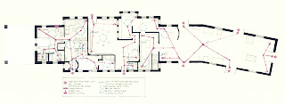
Overall throughout the design, I incorporated my concept and ADA/UD elements into the design. All doorways are 36" wide, all passing hallways and barriers are no less than 36" wide, and high contrast of colors are included to accommodate people with vision impairments. Natural light was combined with additional levels of lighting throughout the space. Tying into both UD design and the use of colors blue, purple, and grey textiles and paints from my concept can be seen throughout the design, as well as circular furnishings. Darker floors and lighter walls allow for clear determination of the floor versus the walls. Also, a sustainable factor was taken into  desperation, keeping a few existing walls in addition to the two required wall, sustainable materials, and shared water walls. The drawings that were completed in the project reiterate and demonstrate the applications of these concepts as seen in the Egress Plan, Demolition Plan, and Furniture Floor Plan.

Furniture Floor Plan

Demolition Plan showing walls and doors to remain, be added, and torn down.

Egress Plan: Farthest travel distance to a safe exit and ADA space requirements.


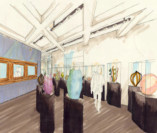
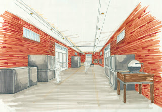
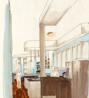
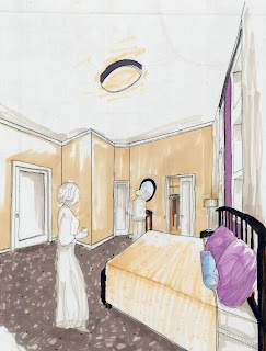
This project took my work as a progressive Interior Designer to a new level. New technical aspects that I was expected to incorporate were applied, following real building codes, and overall working in a time frame that pushed me to be both creative and accurate. Creatively, I believe I improved on developing a concept and carrying that throughout my design and not losing sight of my direction. I In addition to working on my creativity, I was able to practice on my rendering skills and perspective drawings (seen below). Another aspect that I gained sight on is all the different paths I can take with an Interior Design major, whether that be commercial design, residential design, furniture design, textile design, and even being a person that develops concepts and does research on projects. I really enjoyed this project and think it was a great learning experience.

Gallery Perspective with ticket wall to the left.
Studio space with fire resistant concrete floors and existing brick walls.

Entrance of residence, looking into kitchen and living area.

Master bedroom, with view of master bath and walk in closet.


Saturday, March 16, 2013

Gallery Design Review: MAC


In learning about the components that are put into gallery design, visiting the Museum of Arts and Culture (MAC) in Spokane Washington was helpful in actually experiencing these elements. One of the exhibits I studied at the museum was the Lasting Heritage Native American display by Henry Day Ellis. This exhibit was displayed in two rooms, Room A, is 1,710 square feet, and Room B is 2,265 square feet, for a total exhibit space of 3,975 square feet. This specific exhibit displayed artifacts, clothing, paintings, and videos all about the Plateau Indian peoples.
Accessing the exhibit there were two entrances accessible by a ramp and also a two-step stair case between the two rooms. Entering through the main exhibit entrance was an information panel painted on the outside of the exhibit, noting the contributors and sponsors. Next there was a big wall with a nature mural and small glass case with a big sign with the exhibits name. From there, you had the choice to go right or left to visit the glass cases up against the walls.
Main Entrance

Information Panel


The display method was mainly glass cases against the walls and in the center of the room, but also hung paintings on the wall. Depending on what the size of the objects being displayed in the glass cases, some cases had multiple levels of shelving, while others only held one object. Also featured in each room was an audio type display. In one room being an interactive touch screen showing more information on the types of clothing the Indians wore and in the other room a slide show projected on the wall with a video of the Indians history. This provided a different way to present the exhibit for a universal use, as if someone had vision impairment. Other elements added to the space to accent the displaying system was an effective use of lighting. Laid on rails in an exposed ceiling, track lighting was used in the space. With no natural light present, the effect of lighting played a great role in the experience. Light focused and directed directly on the art and not all over lighting placed importance of the pieces. The pieces on the walls were light up by an angle light whereas the pieces in the cases were lighted directly from above.

Touchscreen Interactive Video
Blown Glass displayed in a glass case, lighted from above
The colors also affected the experience, as the exhibit was about the Plateau Indians; earth tones were carried throughout the exhibit. One room was painted a moss green and the other room a burnt orange. In contrast with these colors, quotes were painted in white in a variety of sizes and placements throughout the exhibit. The ceiling was dark brown and almost black to hide the track lighting system frame underneath a brown suspended grid system. The flooring consisted of a light brown carpet with a short pile in order to be easily moveable on.
View from Room A into Room B
Track Lighting with exposed ceiling, Suspended grid system
Circular Glass Case Display
Paintings with painted wall quotes, lighted angled down


In the center of the first room was a circular formation of glass cases displaying shoes next to full clothes of the Indians. There was a relationship of like items in proximity to each other throughout the exhibit. Into the next room, a giant teepee took up the majority of the floor space, next to paintings on the wall, all centered at what appeared to be the 5 foot vision line. To accent the pictures, quotes where painted on the wall rather than being placed on cards.


View of Room B


 Overall, visiting this exhibit was helpful in my understanding of a well-designed gallery space. Being able to experience first-hand all the elements of a well thought out space and how all the components come together to create a good learning and viewing experience.

Vision Disability


Participating in the vision disability workshop was literally an eye opening experience into understanding the difficulties a person with visual impairments faces every day. Simple tasks of everyday life were simulated and I realized how challenging not being able to see clearly effects how situations are approached.
The first task was standing in the Starbucks at the bookie and using a plastic bag folded in half to simulate what a person with 20/60 vision and can still drive during the day. Reading a newspaper was challenging but not impossible, only truly able to see when the newspaper was very close to the face. Next, by folding the plastic bag in half again, representing a legally blind person, looking around was a complete blur. To indicate between spaces, I was very reliant of a contrast of colors, it was hard to differentiate between similar colors as they blurred together.
Two Layers of Plastic
No Filter
The vision simulator tool has four circles, each showing how one would view the world with different impairments. The four types shown are central vision loss, loss of parts, tunnel vision, and blindness (from top to bottom).
Vision Impairment Tool
The next task was to take sunglasses smeared with petroleum jelly, walking through the Bookie into the main walkway of the CUB, using the elevators, and going down a floor to use the ATM. First walking through the CUB, while being unable to see people’s distinct facial features, their faces and bodies were blurry and it was a little difficult to identify their depth and distance from me while walking. In the elevator, there was no real distinction between elevator buttons, but what helped identify where the buttons are from memory and the “ding” helped recognize when the elevator car arrived.
Next, using the ATM machine was far from easy to use alone. There was brail on the number key pad, but the screen with the information was digital and a touch screen. Unless I squinted really hard through the glasses, I wouldn’t have been able to read the screen. There was a flashing light around where your card and envelope was supposed to go and a beeping noise signaling when to insert the card or take your money.
Moving onto the last stop at the library and using the stairs. Depth perception of each step was difficult to differentiate because the stairs had no significant color distinction from one step to the next.  

Sunday, December 9, 2012

Client Brief


Client Philosophy
In the interview with Seth Anawalt, topics of the overall goals, profile and requirements of the St. Elmo building in Palouse, WA renovation were discussed. The main vision Seth wanted to achieve in the apartment spaces and common area in the building was a place that naturalistic, yet classical. In the overall space, he wanted to create a flow with structure, with the ability to “dance through the room” (Anawalt).  An architect he mentioned whose worked he liked was Frank Lloyd Wright, but not as boxy. Keeping the history in the building especially on the exterior prevailed as an important part of the renovation in order to keep the history of the 1887 building. As for the interior, he wants it to “be modern, because we are designing for people who are going to live there, that live in the 21st century. So it will be a mix of the old and the new “ (Anawalt). Seth asked locals what Seth discussed his plans for the second floor renovations we would be working on including the construction on a one bed-room, two bedroom, elevator, stairs and common area. Other areas in the space that will eventually be renovated are an additional two apartment space, spa, and laundry room. Seth expressed his vision to preserve and restore as much of the building as possible. When asked about features that he would like to be kept,  overall, he expresses that he is pretty open to changes, giving the approval to add some coving at the top of the ceiling, changing window shapes, opening the floor plan, and softening up some angles to portray a yin-yang balance. Keeping history was also important, but Seth is contemplating whether to keep the name of St. Elmo’s, the other option Seth may choose is St. Valentines as he envisions a romantic retreat in the future.
Client Profile
            A wide range of occupants are considered for tenants. Seth anticipates a combination of locals renting the apartments and the space of the spa to be a destination for people all over the region. Along with those passing through to stop and eat, visit for a football game, he hopes that it will bring in people from farther destinations. When finished, the building will have eight rooms, and hopefully some can be used as hotel rooms. Unfortunately due to the lack of space, this building will not allow pets on the building.
Materials
            Restoration is essential in this renovation, so Seth stressed that he wanted to keep as much materials from the existing structure as possible. With the materials he will need to bring into the space, he wants natural materials with little to no VOC. “Volatile organic compounds (VOCs) are released as gases from certain solids or liquids, and can cause short- and long-term health effects. Materials that include high levels of VOC are paints and lacquers, paint strippers, cleaning supplies, and building materials and furnishings. High concentrations of VOC are often ten times higher indoors than outside due to the materials” (An Introduction to Indoor Air Quality: Volatile Organic Compounds (VOCs)). To keep the building safe to live in, Seth has requested that the paint, flooring, paneling, etc. accommodate this feature. 
            Other materials Seth preferred to have used in the space included hardwood, stone, marble, granite, and tile. Other sustainable materials he suggested were glass, rock, natural paint, and stainless steel, ceramic, or porcelain sinks. Sustainable materials that have already been used in the space is the lumber, and sub floor with 0 VOC. Other sustainable materials that could be effective in the building that have worked for other homes are “redwood claddings, reclaimed engrained block wood, cork flooring and highly efficient appliances” (Hidden House). Plumbing materials should be eco-friendly PVC pipes, and copper to withstand rats and other animals.
Structure
            With the building over 130 years old, some conflicting issues occurred with the existing structure and the requirements for the new design. On the third floor, which will be completed after the second floor is complete, is four apartments, a men’s spa, and possibly a greenhouse if space permits. Seth also plans to keep the skylight that stretches through the third and second floor. Leading right into the common area, the skylight will provide natural lighting, as it was intended for in 1887. Seth suggests adding to the skylight some glass structure that will play along with the natural lighting. Day light will play a large role in the lighting of this building, though there are windows already installed from the existing structure, he is open to changing the windows. He states he wants to have a unity of windows looking from the outside, but is interested in geometric shaped windows.
            Issues regarding the amenities in the apartment are parking, security, storage space, and noise control. To ensure the safety of the occupants, Seth plans to include double locks on the doors. The spa is public, but open to the residents at all hours. For this issue, Seth will designate times the spa is open and closed to the public. For parking, there is a back lot, but he will further have to check if he is required to provide parking spaces for the tenants. Strict leases will regulate the noise control of the building, and he says he will insulate walls where he think is needed. Built in storage space is included in some of the walls as a pantry/ closet. Other storage will take place as the occupant needs.
            The exterior of the building he hopes to preserve. Seth prefers the old brick look as it fits better in the environment compared to the modern metal worked buildings. In addition, he hopes to restore the 2nd floor balcony, possibly adding balconies on the outside of all the units.
Furnishings
            In the apartments, Seth will not be providing furniture, but will be providing appliances. Though no specific brand has been chosen for the appliances, Seth has created somewhat of a checklist the appliances must meet, such as; high efficiency, green appliance brand, and does not take up a lot of room. He does not want microwaves, and prefers an electric, not gas stove, therefore he prefers a range and a dishwasher is optional. The overall kitchen needs to be spacious, well located appliances, easy access cupboards and cabinets.
            There will be a laundry room located on both floors for the tenants to use. Seth will not be equipping the building with WIFI, as there is a library next door. Later a computer and fitness area will be added off of the common area for the occupant use.
            The vision for the common area is an informal, private, quiet and nice area to give the people in the apartment breathing room. Some seating should be provided but with the idea of the space “flowing” in mind. Seth suggests getting rid of the existing hanging lighting and adding central lighting. On the topic of the spa, an infrared sauna, Jacuzzi, tea room, massage room and shower room will be included.
The design of the St. Elmo’s building is meant to be open and free. A broad palette of earth and sky tones will be used to portray a natural, harmonious atmosphere.
Accessibility
Seth realizes that potentially a young couple could move in and live there until they are in their 70’s which proposes the topic of accessibility in the building. One feature of the building is a five person elevator that will give occupants access to all the floors, accommodating those with a disability. He is very enthusiastic on incorporating universal design including appliances, furnishings, and layouts for aging in place, and people with disabilities.


References
Anawalt, Seth. Group Interview. 5 Sept. 2012
"Hidden House Is a Stunning Example of Sustainable Modern Architecture | Inhabitat - Sustainable Design Innovation, Eco Architecture, Green Building." Hidden House Is a Stunning Example of Sustainable Modern Architecture | Inhabitat - Sustainable Design Innovation, Eco Architecture, Green Building. N.p., n.d. Web. 08 Sept. 2012. <http://inhabitat.com/hidden-house-is-a-stunning-example-of-sustainable-modern-architecture/>.
"An Introduction to Indoor Air Quality: Volatile Organic Compounds (VOCs)." EPA. Environmental Protection Agency, n.d. Web. 08 Sept. 2012. <http://www.epa.gov/iaq/voc.html>.